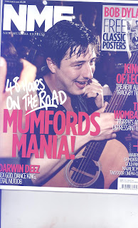
NME is a rock genre magazine that combines features from glossy magazines and also tabloid newspapers. The title block is located in the top left hand corner of the front page in bold white letters. This contrasts with the dark background making it eye-catching so that NME stands out. Just below the title block is the magazines' full name in unabbreviated form, which is ‘New Musical Express’ which happens to be printed in the font Times News Roman. I believe this is done to help readers understand the magazine more and help readers who want to know what NME actually means.
Further down the cover the features of a magazine appear. For instance, the central image spans the entire cover. This is done to express the importance of the featured artist as he dominates the page it sets the president for the rest of the magazine as the reader knows he will be featured in the main article/interview for this issue.
Moreover, the headline partly covers the central image, the secondary leads and cover-lines also do this. I believe this is to show that although the image is important, the text is also important as it is not overshadowed by the central image. I believe this is very clever as it makes both the central image and text both dominant without one being more dominant than the other. Looking the text itself I can see that the magazine will predominantly feature album reviews, music news, artist/band interviews and gossip, all of which the majority of music magazine readers buy them for. Their is also an advertisement for free classic posters on the front cover, this is used to attract people to buy the magazines over other magazines because offers them something rival magazines don't.
This magazine is aimed at rock music lovers from late teens to late thirties. I believe this because even though their are young music artists featured in this magazine, their are a large number of older artists also featured that many younger people may not be so interested in but an older audience definitely would.
The cover’s central image seems very natural and not staged at all, this is because image looks as if it was just taken while he was having fun playing his guitar, making him seem like a fun and more real persona s many other music front covers are obviously staged, so it seems like he doesn't care about that and he just cares about his music.The man also looks very sweaty, this shows that he is hard working but likes his work because he has a beaming smile on his face.
The anchorage text reads ’48 HOURS ON THE ROAD – MUMFORD'S MANIA!’ This suggests the band (Mumford & sons) is extremely dedicated music because of how long they spent on the road touring, but it also shows they care about their fans because they are willing to travel for so long for their enjoyment.The fact that only the lead singer is shown on the front cover shows that he is more important than the rest of them and that he is the most recognisable member of the band because only he is needed to promote their band.
The main colours used on this front cover are black, red and white. These colours do work well together, they don’t clash with each other and are bold colours which help draw attention to the magazine. The fonts used on the cover are mostly sans serif fonts which are simple and bold. The large size makes them attracting and noticeable while the simplicity if the fonts make them easy to read.

No comments:
Post a Comment