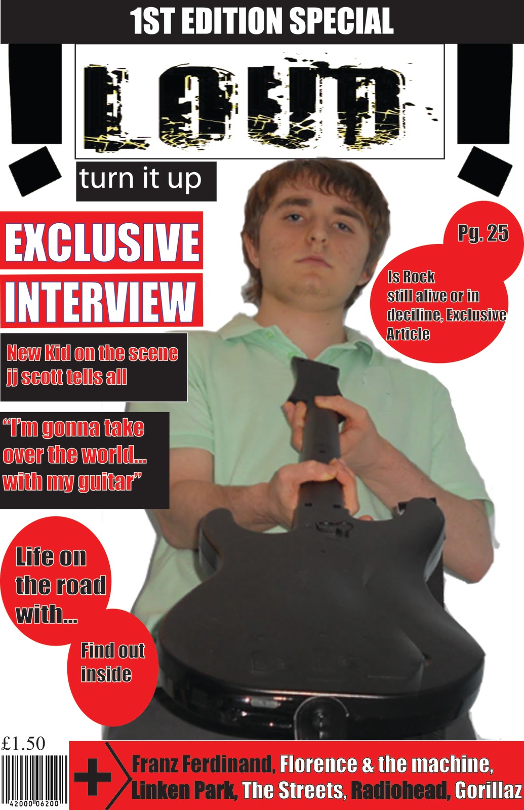
My media product uses the typical conventions of a media product, in this case a music magazine. In my analysis of other music magazine front covers such as Hip-Hop weekly, I knew that the title block should stand out and be at the top of the page, that mode of address for the central image should be looking straight at the audience so that they feel a connection and that there should be puffs also on the front cover to give the reader more information about what’s in the issue and that makes them more likely to buy it. As you can see with my magazine front cover I have followed all of these conventions. Also I included a bar code and a price tag on the front cover. These are both essential on any media product such as a magazine so that the audience knows how much the magazine cost and shopkeepers can scan the bar code and sell the magazine.
When producing the contents page I also followed the typical music magazine conventions. For example, I separated the images and the text to make sure it is not too confusing for the audience to understand and so it is clearly distinguishable between the text and images. Next, I made sure that all pieces of content had corresponding page numbers while creating dedicated sections such as features so that the readers can easily find particular sections. There is quite a lot of text used on the contents page which may be seen as challenging typical conventions as many other magazines prefer to use a small amount of text compared to amount of images.
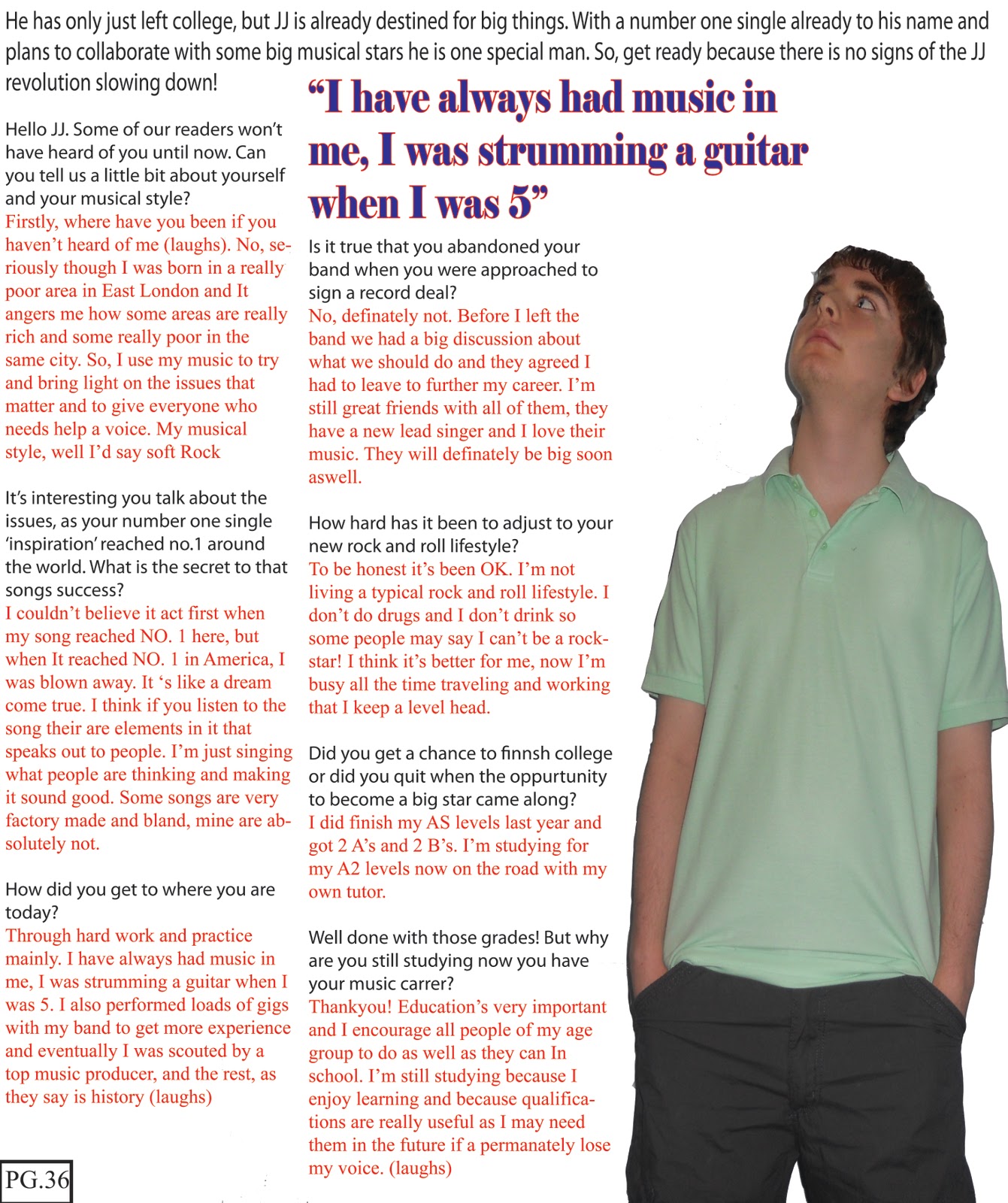
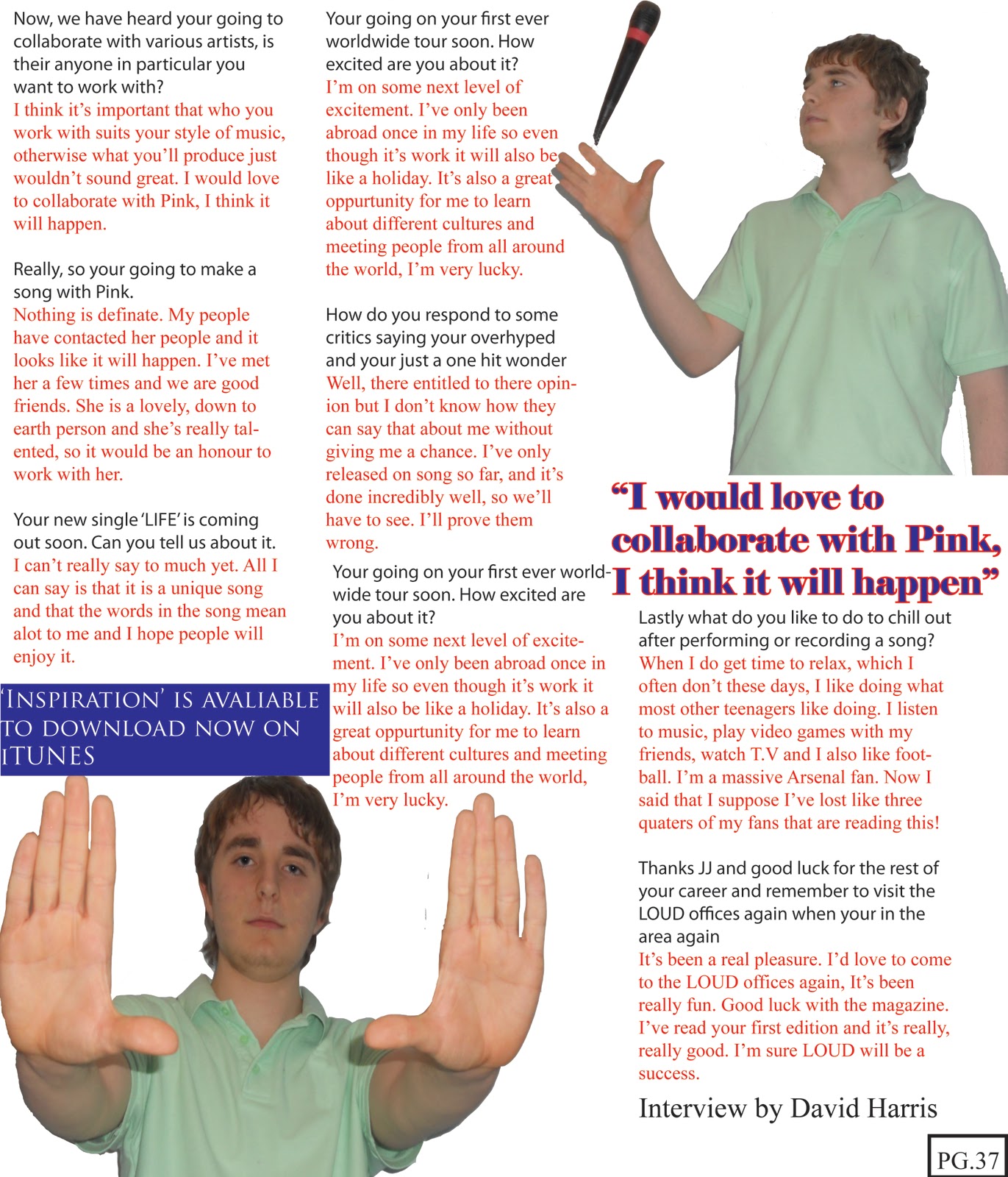
The feature article starts with a large background image of the artist who is interviewed and a small Introduction to the artist. I saturated the image to make it appear more black and white. I did this to make the artist appear more old-fashioned and contrast him to modern day musicians, to show he is different to them. The following three pages contain the interview along with more pictures of the artist. I also placed different quotes from the interview in various locations because I thought those quotes were important and best showed the artists personality. All pages of the article are numbered. So, overall my article does feature the typical conventions of a real media product.
The age group my media product represents are people aged between and near the ages of 16 to 26. I believe my magazine represents that age group positively. This is because the main artist on the front cover and who is the focus of my article falls in to the same category of my target audience. He is shown to be very successful, hardworking and have good morals. As he is representing the people of his age group who will read the magazine he is a positive representation of people of that age as it shows that they are not all lazy and negative to society as other media outlets like newspapers represent younger audiences, and that they can be successful and a positive influence to society.
My magazine also represents people who are in the rock culture as my magazine features articles, interview reviews and news of rock musicians. Again, I believe my magazine represents this sub- culture positively because many other rock magazines such as NME represents rock artists negatively as drug-takers and alcoholics. This makes everyone in the rock sub-culture look bad to the rest of society and rock may become less popular as people don’t want to be associated with these negative things. This would mean that less rock magazines like mine would be sold and would be unsuccessful as the audience and potential new customers would deteriorate. So, I have used my magazine to represent the sub-culture positively by including positive articles about successful rock artist and my main interview is with a young, successful rock artist who doesn’t drink or take drugs. This could in turn, increase my audience as more people would like the way my magazine represents rock artist and rock as a sub-culture.
As my magazine represents a main-stream genre, I would like a main stream publisher to distribute my magazine. The publisher I would like to distribute my magazine is IPC Media. This is my choice because they are a trusted publisher and they distribute many successful magazines, this means that if they distributed my magazine I believe there is a very good chance that it will be successful. IPC Media publish a variety of different magazines such as LOOK, Marie Claire and NME. NME is also a rock magazine and it is very successful and has a large audience. It also has a similar target audience of mostly males aged 16 to19 who like many different styles of rock music. This give’s me confidence as IPC Media have a lot of experience of selling magazines like mine.
Finally IPC MEDIA are well known for linking their magazine brands with other forms of media like; websites, radio stations and TV channels, again all of which would be beneficial to promoting my magazine. For example NME have their own website, online radio station, TV station and mobile phone ring tone service. So I would be extremely confident in IPC media if I wanted to branch out with my magazine if it is successful and also have a radio station etc. as IPC have history and experience of other magazines successfully enabling other forms of media.
The target audience for my magazine is young males aged 16 to 26. The reason why this is my target audience is because the Genre of music my magazine represents, rock, appeals more to males rather than females. I know this because most rock stars who feature on the front cover of magazines such as NME and Q are males so they would appeal more to other males as they feel more connected to them and they appeal to them more. Also, although some females do enjoy rock, they are in the minority so this is why I decided to aim my magazine more at males. The reason why my target audience is males of a young age is because I know through my research of other rock magazines and through my own experience that modern rock music only really appeals to younger people rather than people over the age of 26.
I also set out for my rock magazine to be inspirational to readers. My target audience is people of a young age who are thinking of careers and may want to make it in the music industry. As you can see in my first issue and I plan to do the same on future issues I have chosen some one of a young age who started at the bottom and is becoming successful so readers can aspire to be like him.
My magazine is aimed at people in the social grade D which is working class people living in cities such as London and Birmingham. This is because my magazine features music artists and role models that appeal more to people in a working class background as they are inspirational and these people could aspire to one day is like them and have a better, more successful life like their favourite musicians. The price of my magazine, £1.50, is an affordable price for many people in a working class background as I aim to release new issues every month. I am also releasing my magazines in cities because there is a very large populous of people, meaning my magazine would have a better chance to succeed as more people could buy it rather than launching it in less populated towns where rock music isn’t popular.
I tried to attract the audience through my front cover in different ways. Firstly the central image, as you can see there is a direct mode of address. I chose to do this on the front cover because there would be more of a connection between the artist and the reader and that makes it more likely they would relate to him more and in turn purchase the magazine. Moreover, he is holding out a guitar like he is handing it over to the reader. This will attract the audience as it catches their attention gives them the feeling he is inviting them to join him and read the magazine.
The title block is used also to attract the audience. I chose to use a simple colour scheme of black font on a white background. This is because I didn’t want to use too many colours and over-elaborate it to much so that the actual magazine title ‘LOUD’ is not clear for the reader to see. I chose the title ‘LOUD’ as people who like rock like loud music so it is easily associated with that style of music. It is also simple and to the point which through my research of other music magazines like NME and Q I know the audience prefers it. The effect of the title block where it looks like the letters have been smashed symbolises the rebellious nature of rock and makes the title block stand out and is unique to other magazine title blocks which are simple and don’t have any special effects. The colour scheme is also used to attract the audience. The colour scheme used is very simple as the only colours used are red white and black. Again, I didn’t want to use to many colours on the front cover as it would make it look too unprofessional and the audience may not want to buy the magazine as it would look poorly made and the over use of different colours could confuse the audience on the information given in the front cover.
I also used puffs on the front cover with just the artists name and a hint of a story behind them to entice the reader to find out more about the story by buying the magazine.
Finally, to address my audience I knew through my survey that the participants thought that the pricing for my magazine should be between £1-£2. So to appeal to, and address the audience needs I priced my magazine at £1.50 as this seemed like a fair price for a new magazine on the market.
During my time creating my music magazines I learned a great amount of new skills through different technologies. I was able to learn new skills used for capturing images, editing images and creating different thing needed when making a new music magazines. I was an overwhelming beginner with using these technologies at the start of this project and felt unconfident, now I am confident with these technologies and I believe I have learnt a lot of new skills and techniques.
Firstly, when I had to capture the images I was going to use for my magazine I had to think about many different aspects such as the shot type I needed to use, the lighting, setting costumes and props were all important factors I had to keep in mind when capturing my images. To manipulate and edit the photos I took I used the Adobe Photoshop CS3 and CS5 software. Whilst doing so I learned many new photo editing skills such as; removing red-eye, accurate cropping/scaling, spot healing, contrast balancing, and colour enhancement.
The design of the page layouts for all the different elements of my magazine including the front cover and so on of my magazine was done using software called Adobe Illustrator CS3 and CS5. This software was very important in the production of my magazine as it was simple to use and was essential in completing many important tasks such as text creation/shaping/colouring/positioning and image positioning to be carried out hassle free and very efficiently. I was able to play about with my layouts and make design choices very easily.
The production of the college magazine preliminary task gave me a taste in what skills would be needed for when I would have to create my music magazine. The design of my college magazine front cover was very poor and simplistic and the images I used were of a poor quality, especially in the editing of it. The preliminary task allowed me though to try out different camera angles and lighting effects which helped me decide what camera angles to use in my final music magazine. After taking some experimental images I had the opportunity to start using Photoshop and Illustrator to edit my images. This was the starting blocks to my development in using these different pieces of software's. My college magazine lacked obvious creativity and any professional qualities. My final magazine I believe does have creativity and has a sense of professional quality.
After a lot of practice and a lot of time spent using these technologies, my final music magazine was vastly more successful, had much more professional quality and creativity. I was able to use a new blend of colours and shapes, new effects on my images such as changing the contrast etc. and cropping my images successfully to make the images look more professional. I was now able to use my newly obtained knowledge of typical music magazine conventions with the layout of my music magazine pages and included things like; stand out headlines & anchorage text, attractive short puffs & a menu strip, a big bold central image and a section for magazine info and the bar code. All of these things helped me achieve a look of style and professionalism.
The contrast of professionalism between my two magazines is obvious. I am happy with the outcome of my final music publication and am very happy looking back at my preliminary task, how far I have come and how much I have learnt during my progression during the producing the full product.
Thursday 17 March 2011
Media studies evaluation 2
Check out this SlideShare Presentation:
Media studies evaluation 2
View more presentations from jamzie93.
Friday 4 March 2011
Tuesday 22 February 2011

Monday 21 February 2011

Subscribe to:
Posts (Atom)