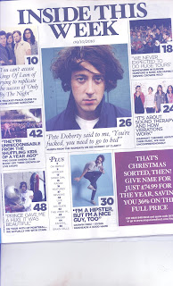
NME CONTENTS PAGE
This magazine's contents page features a number of different images; these images each have a notable quote associated with them and some interesting information about the person or group. This gives the reader a little taste of what’s in this edition and makes them want to read the rest of the magazine.
The fact that images overshadow the text shows that this magazine is relying on imagery to entice the reader rather than the text, and it also shows that the editors believe that the readers prefer images rather than a large amount of text on the contents page. However, there is also quite a bit of descriptive text featured on the page considering that the contents is a single page, so overall I think there is a fair amount of text for the size of the page.
The main colours used are black and white. This symbolises the fact that this magazine is not over elaborate; it is simply a rock magazine which their target audience wants. The fonts used are mostly serif fonts (Times New Roman etc.). These fonts make the magazine seem more sophisticated and professional, making it appeal more to the reader.
The layout of this page intentionally puts more emphasis on the main features articles and interviews, by accompanying larger font with large image. The purpose of this is to help the audience know where to locate the main articles which they would want to read. All of the other content in the magazine is located an index with page numbers at the bottom of the page so that the audience know where to locate that content.
The contents of this page are separated by black lines. The purpose of this is to make it more organised and easier for the reader to distinguish between the different articles. The contents page also has a promotional offer in the bottom right corner of the page offering the audience a 36% saving on the full price of the magazine by giving NME £74.99 for the year. These promotional offers are important because it helps gain the magazine money and a larger audience. Also, the promotional offer is in a pink box which is unique on this page. This draws the reader’s eyes to it and makes it likely that they will read it.
The NME logo does not feature anywhere on the contents page suggesting that they are already a well-known brand that they don't need to show their logo again on the contents page.

No comments:
Post a Comment