Wednesday, 15 December 2010

Title Block evaluation

The denotation of this title block is that the letters are big and bold and are bright red, which is very eye-catching. The background is black which contrasts with the red letters to also further make the title block stand out as the aim of the magazine's designers is to make a magazine that people automatically notice in shops etc. The connotation of this is that it represents the magazine as also being bold and exciting to read. Also the word Vibe means a distinctive emotional atmosphere which could mean that this magazine is also emotional. The word VIBE could also represent that the magazine is for younger people as that particular word is often used by the younger generation of early teens to early 30's and not people of an older generation.


The denotation of this title block is that the letters are bold and yellow and stand out against the black background. Although it is successful in making the title block stand out, it is also very underwhelming and bland, which makes me think that the actual magazine is like this also. The title ‘the source’ suggests this magazine is the best magazine to get everything the reader wants to know regarding this magazines genre, it suggests it is the only magazine to give you information other magazines would not give you.


This title block is very interesting. The red background makes the white ‘Q’ bold and eye-catching. Red could symbolise the passion this magazine has for the specific music genre, rock that it centres around. The white colour could symbolise pureness, meaning this is a pure music magazine and nothing else. The ‘Q’ is in italics and seems like it is times new roman, which is a sophisticated font size, this could show that the magazine is also sophisticated and has more class than the other music magazines on the market. The actual title ‘Q’ can also mean a number of things. For example, it sounds like queue, meaning that this magazine is very popular and it also sounds like cue, which is a musical term.


Kerrang is a music magazine specifically for the rock genre. The style of this title block is very bold and destructive. The letters consists of visible cracks.The connotation of this is to show that the magazine is hardcore and so powerful that it can literally crack words. It could also symbolise that Rock music isn't all happy and perfect, there are cracks in it but that is what makes rock music great. The word kerrang actually sounds like a noise that may be produced when using a musical instrument, connecting the title to the genre. The text is only in black. This colour could be representing the darkness that rock music is generally associated with. The fact that the title block uses just one colour shows that this magazine is simply a rock magazine and nothing else. The choice of colour for the text, black, may also be seen as very stereotypical because it is seen as only goths and EMO's like rock music and they only like the colour black, so this title block is trying to appeal to that specific audience.

Monday, 6 December 2010

Magazine Proposal

I have chosen the main genre for my magazine to be rock music as I believe there is a gap in the market for a fresh new rock magazine and there is still a large audience who enjoy rock music. Many people responded positively to my questionairre based on the rock music magazine I aim to produce, this tells me there is a large audience who would be interested in purchasing my magazine when it is produced. The target audience for my magazine will be multi-gender and from a variety of different social back grounds. The target audience will be from the ages of 16-30 because due to the survey I had done, it has proven the genre I have chosen is popular with people from the ages of 16-19 but I also believe many people over the age of 19 to 30 also enjoy rock music, therefore they are also in my target audience. I believe my magazine needs to be enlisted into the market because many rock magazines are too similar, I want my magazine to be original and something fresh that rock enthusiasts will enjoy to read.

Monday, 15 November 2010

Magazine research

Bauer
Website: http://www.bauer.co.uk/
Bauer is the largest privately owned publisher in Europe, publishing in Germany, France, Spain, Portugal and the United Kingdom. Additionally, Bauer publishes in the United States and Mexico. Bauer is a mainstream publisher.
Bauer’s brands are predominately aimed at working class women. They own women’s weekly’s like Bella, Take a Break and that’s Life. They also own women’s interest magazines that are Eat in, Take a Break’s fate and fortune, Spirit & Destiny, Take a breaks fiction feast, Take a breaks seasonal magazine’s and That’s life seasonal specials. They also own TV listings magazines and puzzle magazines. This company produces mainstream magazines because even though their target audience is mainly women, they are produced for a large audience and they produce puzzle magazines for a wide audience of older men and women.

IPC Media
Website: www.ipcmedia.com
File:IPC logo.jpgIPC Media is a mainstream publisher. They produce over 85 iconic media brands. IPC Media's print brands reach almost two thirds of UK women and 44% of UK men. That is almost 27 million UK adults. IPC Media's online brands also collectively reach 20 million users every month.


IPC Media groups its current titles under five magazine divisions: Connect (women's weeklies such as Now Magazine and Look), Inspire (leisure and specialist), Ignite! (men's lifestyle and entertainment), South Bank (women's lifestyle and home interest), and TX (portfolio of television titles). In addition there are: Ideal Home; and Market force, the UK's leading magazine distribution business.

IPC Media's magazines are very diverse, so they publish magazines aimed at both men and women of different social classes. There magazines aimed at men are for example, Country Life, Horse & Hound, Rugby World and Decanter, as well as lifestyle brands including Nuts, Mousebreaker and NME. Their magazines aimed at women range from Look, Now, Chat and Woman. IPC Medias also own TV entertainment brands including What's on TV, TV Times and TV & Satellite Week which are aimed at both sexes who enjoy television.

BBC Magazines
BBC Magazines are a mainstream publisher as they publish many different genre of magazines for many different age groups.  BBC Magazines is the magazine publishing division of BBC Worldwide, the commercial subsidiary of the British Broadcasting Corporation. They publish adult magazines like BBC Countryfile, BBC History Magazine and BBC Music Magazine. They also publish cooking, wildlife, gardening and car magazines as well. They also publish Top of the Pops magazine aimed at teens and more magazines aimed at children and pre-school children. This means that they cater for a large amount of people of different ages and interests.

Development Hell
 Development Hell is an independent media company based in Islington, London. They are a niche publisher as they only publish two magazines, The Word and Mixmag. The Word is a music magazine aimed at late teens to early 30's and Mixmag is a dance music and clubbing magazine aimed at people in their late teens to early 20's. In April 2009 Developmentell acquired DontStayIn.com, the world's biggest clubbing social network. Development hell ave provided consultancy for some of Britain’s biggest publishers such as Dennis, Future and IPC and were hired by Paul McCartney to produce the souvenir magazine for his 2002 World Tour.

Monday, 8 November 2010

contents page analysis


The contents page uses many different images that relate to the genre of music this magazines readers enjoy, which is rock. These images have been constructed to appeal to the target audience as there are images of rock and punk musicians and the pictures are also very dark and the people in the pictures all look very sub duded as there is no one smiling or looking generally happy as most rock musicians are associated with darkness and sadness. There are ten different images used in the contents page which fills the front cover. This images have been used to illustrate the different articles the contents page are referring to in the magazine.

The colour red is used predominantly in the front cover. This may have been chosen because it relates to the magazine logo being red so the reader gets a sense of familiarity in the magazine. This colour may also symbolise passion, meaning the magazine is very passionate about its genre or it may symbolise anger as rock stars are often associated as being aggressive and intimidating. All of the font used in this contents page is serif. A house style is being developed because the colours, images and font styles are all similar on the front cover, contents page and article.

The information is organised in a way to make it easier for readers to find a particular feature or article. This is because all of  the information is organised into different sections which are features, the Q review and regulars. This is very useful to new and regular customers because if your looking for a review of a certain album etc. you can locate that section on the contents page to swiftly and easily find the review your looking for. This suggests that this magazine is very organised and well produced as their front cover is so.


There isn't any promotional features in the contents page as such promoting any brands or it self, but they do promote the artists that they are interviewing or featuring etc. For example, this magazines main interview for this issue is with Cheryl Cole and they reveal her new music and when it is released.


The logo of this magazine is located in four places in the contents page, it is located on a image of the magazine front cover in the top right hand corner of the first page, there is two images of their logo on the bottom of the two pages which are really small and their is a large image of their logo on the top left hand corner next to the title 'Contents'. I believe they are very dominant because where ever you look on the contents it is highly likely the reader will see an image of the Q logo. This means the reader will constantly recognise the magazine and it also makes the brand label more memorable.

Monday, 1 November 2010

Cheryl cole article analysis


The choice of artist in this feature article is Cheryl Cole. She is a popular pop star, a member of the successful girl group, girls aloud and she is on the judging panel of the most popular music talent show on British TV, X Factor. Using Cheryl Cole for this article suggests they have a very wide range for a target audience. A vast number of young girls, young women and even older women like Cheryl Cole. Even young men and older men like her because of her attractiveness. Also many people in the fashion world like her because of her fashion sense, many females want to dress and look like her and fans of music like her because of her successful singing career. This all suggests that this magazine is constructed to appeal to a wider audience and branch out from its usual audience of rock lovers to fans of other genres.


The language used is very informal as it is not meant to be a serious interview or interrogation as this would make the interview more uncomfortable and less enjoyable for the reader. The article is constructed to be more like a comfortable chat between the interviewer and Cheryl Cole, although there are some very poignant quotes from the artist. For example she says “I don’t know what I look like any more. Do you know what I mean?” This shows that she does feel quite sad and gives the receiver a very personal look inside Cheryl Cole’s mind. The reader also knows this is an important quote because they made this quote stands out by putting it in red, larger font and put in a text bubble, separate from the article.


The tone used by the magazine to address the reader is much like an informed intelligent fan. This is because he is able to give the readers intimate details about Cheryl Cole because he has prob ally thoroughly researched her and has had the opportunity to speak to her face to face so he can tell the audience details about her they may not already know. For example he writes " She is the only person who has topped both FHM magazine's world's sexiest woman poll and a list of Britains's 'most-requested teeth' from cosmetic dentist's.


The style of text used for this article is serif. This shows that this magazine is sophisticated and well presented because the style of the writing is also very sophisticated. The magazine may also have chose this style because they may want to link the style of the text to the classiness of Cheryl Cole. The way the interview is laid out is a mixture of facts and opinions and questions and answers. I think they chose to do it like this because it is more enjoyable to read rather than straight questions and answers.   


There is a mid-shot of Cheryl Cole wearing a revealing outfit and a top hat that covers much of her face. This makes her seem more mysterious as we can't fully see what she looks like. The choice of outfit shows she is confident in her appearance and it shows she isn't just the family friendly person we see on the X-factor, but she also has a much more adult side to her. I don't think that this article requires any prior knowledge because it gives us a lot of details and facts about Cheryl Cole, so if there is any thing the audience doesn't know this article will inform them on it.

Monday, 18 October 2010

Magazine article analysis


Hip-Hop Weekly

The person featured in the article is Terry Kennedy. He is a pro skateboarder but is also establishing rap group and new clothing line. This makes me think that the target audience is teenagers and people who are in their early 20’s who enjoy rap music or skateboarding. The language used is very informal and a lot of slang and colloquial language is used. The language appeals to the audience because they can relate to it, in other words they usually use the same type of language, and because it is informal it makes the interview more relaxed and enjoyable to read.


The tone used by this magazine for this particular article is an informed intelligent fan. For example it says “Pro skateboard aficionado Terry Kennedy has made his mark on the industry, but he’s taking the sport to a new level on his upcoming BET reality series.” Because the magazine is telling us information we don’t know, it is as if they are an informed friend telling us this new information we want to know.


In this interview the style of the text for the question is San serif and the style for the answer is serif. This is similar to other interviews in the text because they all use two different font styles for the questions and answers. The way the interview is laid out makes it easy to understand and more enjoyable to read because after every question and answer there is a gap so you know the next question is separate. Also the question is in yellow font and the answer is in white font, making it easier to understand the interview which makes it more enjoyable and less of a hassle to read.


Most of the pages in this magazine use images that outnumber and overshadow the small amount of text used on each page. This shows that they believe that their audience prefers to look at the different images they produce than the text that would go with. They value their images over their text, probably because they think their audience prefers their images compared to their text.


The image used to present the artist makes him look happy with life, powerful and a confident person. They have done this by using a low angle shot, to make him look like he is looking down on the reader so we get a sense that he is a strong and powerful person. Also, the fact he has a big beaming smile and he has his thumbs up shows his happiness and that life must be going well for him at the moment. The caption used below the image is “Being Terry Kennedy” and his name is in bright yellow text. This makes the reader think that the following article is going to give us a competent insight into the artists life making the reader know more about the artist. Also the fact that his name is in bright yellow text could represent the sun and show that his life at the moment is bright and happy, which is often associated with the sun.


The style of the front cover matches the style of the article because they both use bright yellow text and they both have a main central image. A house style is used across the whole magazine as every page has a similar format and uses the same font style and colour. I don't think the article really needs the reader to have any prior knowledge because the content of the interview gives the reader a lot of information about Terry Kennedy and also the caption before it tells us a little bit about him. I do think it helps though if you have know a little bit about him beforehand though so you can enjoy reading about him more.
           
NME
      The artist in this article is a very popular musician called Hayley Williams. Her genre's are alternative rock, emo and pop punk. This suggests to me that the target audience for this magazine is people who enjoy these different genre's of music. I also think that the target audience would be mid teens to late 30's, because this is the age group that mostly enjoy these different genre's of music.

     The language used in this article is standard English and no slang is used. This language would appeal to the audience because it makes the magazine look more academic and if the magazine just used magazine and slang all the time it would make the magazine look ridiculous and discourage their target audience from buying the magazine. An example of standard English they used is " While her time in the spotlight has served to fortify her belief in herself..."

      The tone of the magazine is an informed intelligent fan because it informs the reader about facts, quotes and opinions about Hayley Williams which they are likely to enjoy. For example the articles tells us she was born in Meridian, Mississippi and it also tells us that Hayley Williams says "We're worth listening to. There is no one else like us." This type of information would be well received by Hayley William fans and NME readers.

      The style of text used throughout the text is San serif. This same text style is used throughout the whole magazine. This shows the magazine is very consistent and there isn't much variety. It also shows that the readers prefer a more consistent style throughout the whole magazine. The way the article is layed out is a mixture of facts opinions and quotes from Hayley Williams.The pages in this magazine are all very similar. The posters in the magazine all have a similar colour scheme.


Friday, 15 October 2010

Tuesday, 12 October 2010

Front cover analysis

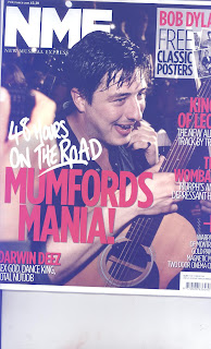
NME is a rock genre magazine that combines features from glossy magazines and also tabloid newspapers. The title block is located in the top left hand corner of the front page in bold white letters. This contrasts with the dark background making it eye-catching so that NME stands out. Just below the title block is the magazines' full name in unabbreviated form, which is ‘New Musical Express’ which happens to be printed in the font Times News Roman. I believe this is done to help readers understand the magazine more and help readers who want to know what NME actually means.

Further down the cover the features of a magazine appear. For instance, the central image spans the entire cover. This is done to express the importance of the featured artist as he dominates the page it sets the president for the rest of the magazine as the reader knows he will be featured in the main article/interview for this issue.

Moreover, the headline partly covers the central image, the secondary leads and cover-lines also do this. I believe this is to show that although the image is important, the text is also important as it is not overshadowed by the central image. I believe this is very clever as it makes both the central image and text both dominant without one being more dominant than the other. Looking the text itself I can see that the magazine will predominantly feature album reviews, music news, artist/band interviews and gossip, all of which the majority of music magazine readers buy them for. Their is also an advertisement for free classic posters on the front cover, this is used to attract people to buy the magazines over other magazines because offers them something rival magazines don't.

This magazine is aimed at rock music lovers from late teens to late thirties. I believe this because even though their are young music artists featured in this magazine, their are a large number of older artists also featured that many younger people may not be so interested in but an older audience definitely would.

The cover’s central image seems very natural and not staged at all, this is because image looks as if it was just taken while he was having fun playing his guitar, making him seem like a fun and more real persona s many other music front covers are obviously staged, so it seems like he doesn't care about that and he just cares about his music.The man also looks very sweaty, this shows that he is hard working but likes his work because he has a beaming smile on his face.

The anchorage text reads ’48 HOURS ON THE ROAD – MUMFORD'S MANIA!’ This suggests the band (Mumford & sons) is extremely dedicated music because of how long they spent on the road touring, but it also shows they care about their fans because they are willing to travel for so long for their enjoyment.The fact that only the lead singer is shown on the front cover shows that he is more important than the rest of them and that he is the most recognisable member of the band because only he is needed to promote their band.
  
The main colours used on this front cover are black, red and white. These colours do work well together, they don’t clash with each other and are bold colours which help draw attention to the magazine. The fonts used on the cover are mostly sans serif fonts which are simple and bold. The large size makes them attracting and noticeable while the simplicity if the fonts make them easy to read.

Monday, 11 October 2010

Music magazine 1st draft

Meeting in studio after just recording her 2nd music video photo shoot outside
So Amy M, what’s it like being back in London after touring America for so long?
Well, I’m not gonna lie, It kind of a relief. Don’t get me wrong, I love America, the people there are fantastic, so welcoming and friendly, and everyone loves music, there is such a great variety of different genres all across the States, from country to blues, it’s wonderful. Their food is too good as well (laughing) I miss the cheeseburgers and fries already, but I also missed London so much, it’s great to get to see all my family and friends after so long, plus I’m going to a party tonight to welcome me back and congratulate me, so I couldn’t be happier really.
How were you received across the pond? How well did people receive your music and did you pick up any new fans along the tour?
To be honest, I was a little nervous about touring the States at first. I wasn’t sure if many people knew me or if they would like my music. All my family, friends, fans and management here reassured me that after my first single came out, I was sure to be popular over there because my first single was such a big hit in the UK. They made me feel a lot better but I was still a little unsure. Thankfully though, the Americans seemed to like me and my music and I feel that tour has been so helpful in gaining me more fans.
So now your back home, there’s not much time for you to rest or celebrate because your back recording your new single and recording a new music video. Can you tell us a little bit about it?
I’d love to. My new single coming out in a couple of weeks time is called ‘No love lost’. Basically it’s about a previous relationship I had with someone which sort of fell apart. But it wasn’t one of your typical break-up’s, we both never cheated or anything like that, we just weren’t really clicking as boyfriend and girlfriend so we split up, but we are still really good friends, so I just wanted to make a song expressing my feelings that not all break-ups have to be bitter or end on a sad note, It is a really upbeat song and I think my fans will really like it.
And the new music video?
Oh, yes, I’m also recording the video for it and I’m having so much fun. I love getting dressed in extravagant costumes and having people put make-up on me. I think quite a few artists don’t enjoy shooting videos, but I love it, especially seeing how well the music matches the video, I just feel it gives the lyrics more feeling and it just helps you to enjoy the music more.
There are loads of artists out there these days that are collaborating and making music together, are their any musicians that you would like to collaborate with?
That is a great question. I would love to collaborate with an artist whose genre is different to mine and make a unique sound. There are loads of fantastic musicians performing right now, like Tinie Tempah, Professor Green and so on but if I had to choose some one to collaborate with I would have to choose Plan B. I love his music and he is like a one of a kind artist the way he mixes together a very jazzy sound with rap, the best of both (laughing), I just think it would be a pleasure to work with him, so if your reading Prof (winking and laughing) you think maybe we could get together (more laughter).
For our readers who want to be like you when their older, have you got any advice for them if they want to get in the music business?
Well I suppose the best piece of advice I could give is to never give up. I was rejected by many record labels and I was not well received at many small gigs, but I never stopped giving up on my dream and I kept on going until I finally got my big break and signed up to my first record label. So I would say that if music is your passion and if being a music artist is your dream, don’t let rejections and criticism get you down, many well known artists were rejected early on in their careers, so don’t let anything stop you from becoming what you want to be, whatever you want to be. 

Sunday, 10 October 2010

Analysing a magazine cover


The magazine I am analysing seems to be a mixture of both music and gossip. I know it is a music magazine because the main title at the top is Hip-Hop, a genre of music but I also know it contains gossip because the letters in yellow font are gossip and it reminds me of other gossip magazines on the market. Including the puffs on the right side of the cover, it makes me think this magazine mixes together popular musicians with gossip about them.


The target audience for this magazine seems to be young, mainly black people who like hip-hop. I say this because the majority of the people on the cover are black and are idols to alot of young black people. The age-group of the people who would read this would be 14-25 year olds because the people on the cover are also young so you they can feel similar to them.


The whole purpose of this front cover is to make the audience want to buy it and read it. This cover uses different techniques to achieve this. Firstly, The main two people on the cover, who we both got mid shots of are soulja boy and kat, who are both well- known celebrities, so the audience will want to find out why both their pictures are side by side and what is there connection, plus the yellow writing and bullet points give the audience a little taste of the gossip about them and makes them want to find out more and buy the magazine.


The puffs on the side also make the audience want to read the magazine because it tells us only a small bit of really juicy gossip, so it leaves you wanting to find out more. For example, the puff about Timbaland says 'Attempts suicide after robbery !?' This is a very clever way of making the reader want to find out more because the question mark makes you want to find out if that really amazing piece of information is true or not.


The part at the bottom of the magazine says plus inside and gives the names of various well known hip hop musicians. This makes you want to find out why these various people are in that edition of the magazine and what exclusive interviews or information the magazine has on them.

Friday, 1 October 2010

To make my preliminary college magazine I used Adobe Photoshop and Adobe Illustrator. When using Photoshop I learned some new skills. For example, I learned how to use the magic wand tool to delete the background of my picture. I also learned how to effectively use the lasso tool and the magnetic lasso tool. I can now also use the rubber tool to delete some of the background. In Illustrator I learned how to put text on to my front cover using different sizes, colours and fonts. I also discovered how to change the background cover without blocking out my image by lowering the opacity. I also learnt how to put boxes around my text by using the rounded rectangle tool and lowering the opacity.

Monday, 20 September 2010

Britney Spears magazine cover

Close Analysis of a Media Text

              Cover 1
       The type of shot that has been used is called a medium long shot/ aerial shot. The image is framed so that you can’t see the bottom of your legs and the photo is more focused on her midriff and face. I think this type of shot has been used so that her features stand out far more to the reader and because it also clearly expresses her sexuality.

       In the picture Britney is wearing an unbuttoned lose top with a bra and she is wearing briefs. This suggests she wants her image to be sexy and provocative. This image will appeal more to men because they will like the way she looks but it can also appeal to some women because they may admire her confidence and aspire to be like her.

      The props that have been used are a telephone and a teletuby bear. The bear suggests that she is still young and innocent, like a child, and the telephone may suggest she is speaking provocatively to a man because of the way she is dressed while she is talking on the phone.

      The setting used is pink sheets which suggest she is lying on a bed. The connotation of this is very provocative because beds are usually linked to sexuality.The intertextual reference being made is the teletuby bear. The connotations of this are that she is being portrayed as a young, innocent child because a lot of really young kids like the teletubys. It may also suggest that like a young child, Britney is also still very naive and venerable and needs protection, which is linked to her personal life.

      The colours used are pink and purple accept from her bra which is black. These colours are used because pink and purple are usually linked to girls, making Britney seem very girly so very young girls will also like her because they will feel like they have a link with Britney. I also think black was used to show she still has a serious, adult side to her although ultimately she stills wants her image to be more girly because the brighter colours overwhelm the darker colours much more.   
     Cover 2
The shot of Britney is a long shot and it has been cropped so that she is on the centre of the cover. I think they used a long shot of Britney because they wanted to fully show of all of her features and they cropped it in the middle because they want Britney to be the centre of attention and the main attraction for the magazine.
Her costume is just underware and I think a piece of cloth to cover her breasts. She is also conveying a seductive and premiscuis pose as she is trying to show of all of her curves and features by the way she is standing. I think this means she wants quite a close, personal or even sexual relationship with the reader because of how she is posing and the lack of clothes she has on. The setting used seems to be a narrow hall way. The connotations of this is that she feels claustrophobic and that she has no space in her life bacause she is such a high profile celebrity. Also it is plain white which could meen even though she has a hectic and colourful life she would prefer to have a more plain and easy life.
The lighting thats used is bright and clearly shows Britney in the middle. It is used in a way to fully show and clearly show the way Britney is posing and how she looks. There isn't much colour used for this cover. Her costume is plain white and the hall way is also plain white. This could mean she urns for a more simple and easy life. On the other hand, her hair clearly contrasts with the rest of the cover as it is blonde. This could enforce the stereotype that all blonds are just dumb models but it could also mean she want to show the reader that she still has a fun side to her.

Cover 3
 I think this image has been chosen because it shows really clearly how serious Britney is after every thing that went on in her private life. The look on her face also makes me think she looks guilty or sorry becuse of her actions. The use of black and white is also significent because it shows she doesn't want any more drama in her life and  she justs wants to be a normal person. If they used colour it would be contradicting because you wouldn't think she was as serious or upset if they used lots of bright colours compared to just black and white.
The image has been cropped to make her face completely dominate the screen. This could be because they wanted to atract Britney fans to buy her magazine or it could of been done to show that Britney is the focal point of that edition of the magazine. I think she wants a more serious and personal relationship with the audience and that she wants to use them to let out all of her feelings. The title 'Britney Spears inside an American tradegy' makes me think she is extremely upset and wants to tell the audience her feelings and explain to them her side of the story.


Sunday, 19 September 2010

Welcome to my blog. Throughout the year I am hoping to learn more about the conventions of magazines and how they are made for their audience to enjoy. I am also going to learn enough about music magazines to eventually be able to make my own music magazine.