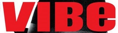
 The denotation of this title block is that the letters are big and bold and are bright red, which is very eye-catching. The background is black which contrasts with the red letters to also further make the title block stand out as the aim of the magazine's designers is to make a magazine that people automatically notice in shops etc. The connotation of this is that it represents the magazine as also being bold and exciting to read. Also the word Vibe means a distinctive emotional atmosphere which could mean that this magazine is also emotional. The word VIBE could also represent that the magazine is for younger people as that particular word is often used by the younger generation of early teens to early 30's and not people of an older generation.
 The denotation of this title block is that the letters are bold and yellow and stand out against the black background. Although it is successful in making the title block stand out, it is also very underwhelming and bland, which makes me think that the actual magazine is like this also. The title ‘the source’ suggests this magazine is the best magazine to get everything the reader wants to know regarding this magazines genre, it suggests it is the only magazine to give you information other magazines would not give you.
This title block is very interesting. The red background makes the white ‘Q’ bold and eye-catching. Red could symbolise the passion this magazine has for the specific music genre, rock that it centres around. The white colour could symbolise pureness, meaning this is a pure music magazine and nothing else. The ‘Q’ is in italics and seems like it is times new roman, which is a sophisticated font size, this could show that the magazine is also sophisticated and has more class than the other music magazines on the market. The actual title ‘Q’ can also mean a number of things. For example, it sounds like queue, meaning that this magazine is very popular and it also sounds like cue, which is a musical term.
 Kerrang is a music magazine specifically for the rock genre. The style of this title block is very bold and destructive. The letters consists of visible cracks.The connotation of this is to show that the magazine is hardcore and so powerful that it can literally crack words. It could also symbolise that Rock music isn't all happy and perfect, there are cracks in it but that is what makes rock music great. The word kerrang actually sounds like a noise that may be produced when using a musical instrument, connecting the title to the genre. The text is only in black. This colour could be representing the darkness that rock music is generally associated with. The fact that the title block uses just one colour shows that this magazine is simply a rock magazine and nothing else. The choice of colour for the text, black, may also be seen as very stereotypical because it is seen as only goths and EMO's like rock music and they only like the colour black, so this title block is trying to appeal to that specific audience.